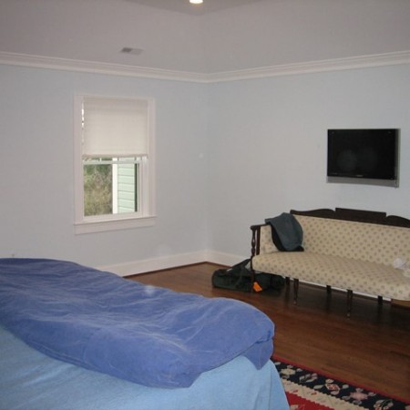
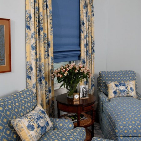
Only the ethereal pale blue wall color and the wall-hung television monitor were “keepers” in this Chevy Chase master bedroom. The transition from “before” to “after” is pretty startling. First— one can see what a difference window coverings can make in the impression of a window’s overall size and appearance. Side panels hanging mostly outside the width of the window, and hanging almost from crown molding to floor, give the impression of a much larger window… in addition to offering color, pattern, warmth and contrasts…. A large Wilton area rug covers much of the room’s wood floor, and the corner is defined as a sitting area with a chaise, lounge chair and ottoman, as well as a warm wood and cane side table. Outside of view is a custom built media cabinet to conceal the television screen, a couple of lustrous wood bureaus, as well as a spectacular four poster bed, side tables, and loads more well-dressed windows…. The room went from Spartan to spectacular— a private haven for the homeowners to enjoy.
Author Archives: Nadine Gilden
What’s In A Room: Before and After No. 2
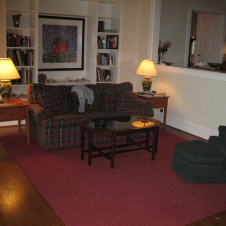
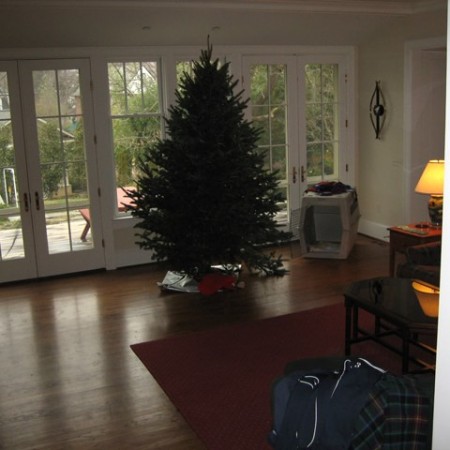
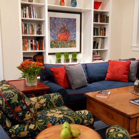
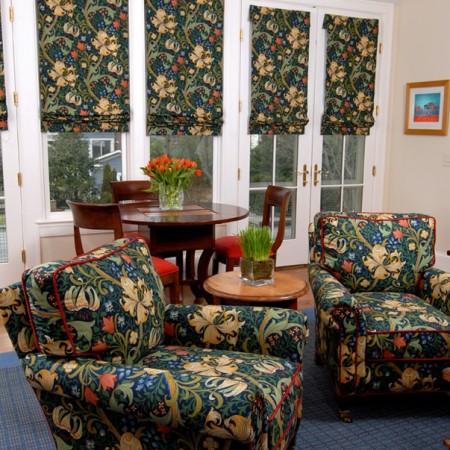
In this Chevy Chase family room, the “givens” designated by the homeowners were the built-in bookcases, the lithograph and the wall color— everything else was ripe for change. The room is a pale yellow (which doesn’t show all that well in the photos!) The homeowners wanted a room that would embrace friends and family for relaxing, playing games, visiting and hanging out. The artwork provided the springboard for room’s color palette— the rich bouquet of greens, blues and oranges was such fun to work with. The classic William Morris fabric shown on the lounge chairs (also used for custom roman shades on the windows and doors) brings in the colors with a burst of vibrant patterning as well… To offset the floral fabric, I chose cozy cadet blue and vermilion chenille fabrics for the sectional. The area rug from Stark Carpet bears a plaid pattern that brings in the same colors as well. The warm tones of natural pine and painted woods add depth and texture to the mix.
What’s In A Room: Before and After No. 1
How does the design process evolve?
In my view, the design process evolves differently every single time, based on “givens” (items that the client wants to re-use), client objectives and preferences, the layout and “bones” of the room— and more.
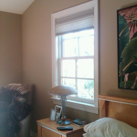
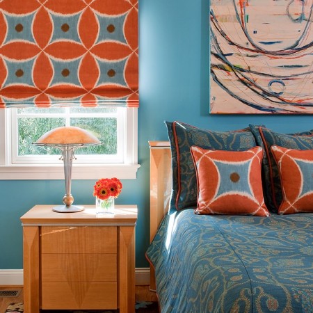
In this master bedroom, you see the same nightstands, same bed, and same table lamps… But what a transformation! The wall color in the “before” photo does not flatter the distinctive wood furniture in the room, nor does it work well with the natural light pouring in the windows. I suggested that a bold blue backdrop would effectively complement these elements. The window shades in the “before” photo clearly don’t provide any drama or warmth, nor does the bedding. By using a large colorful geometric fabric, the window treatments and throw pillows add a bold, fun design element to the room. In the after picture, the wall color plays magically off the fabric choices, and the Company C area rug and custom painting by Susan Finsen provide contrasts in scale, accent, and color. Just a few changes, and what a dramatic result!

