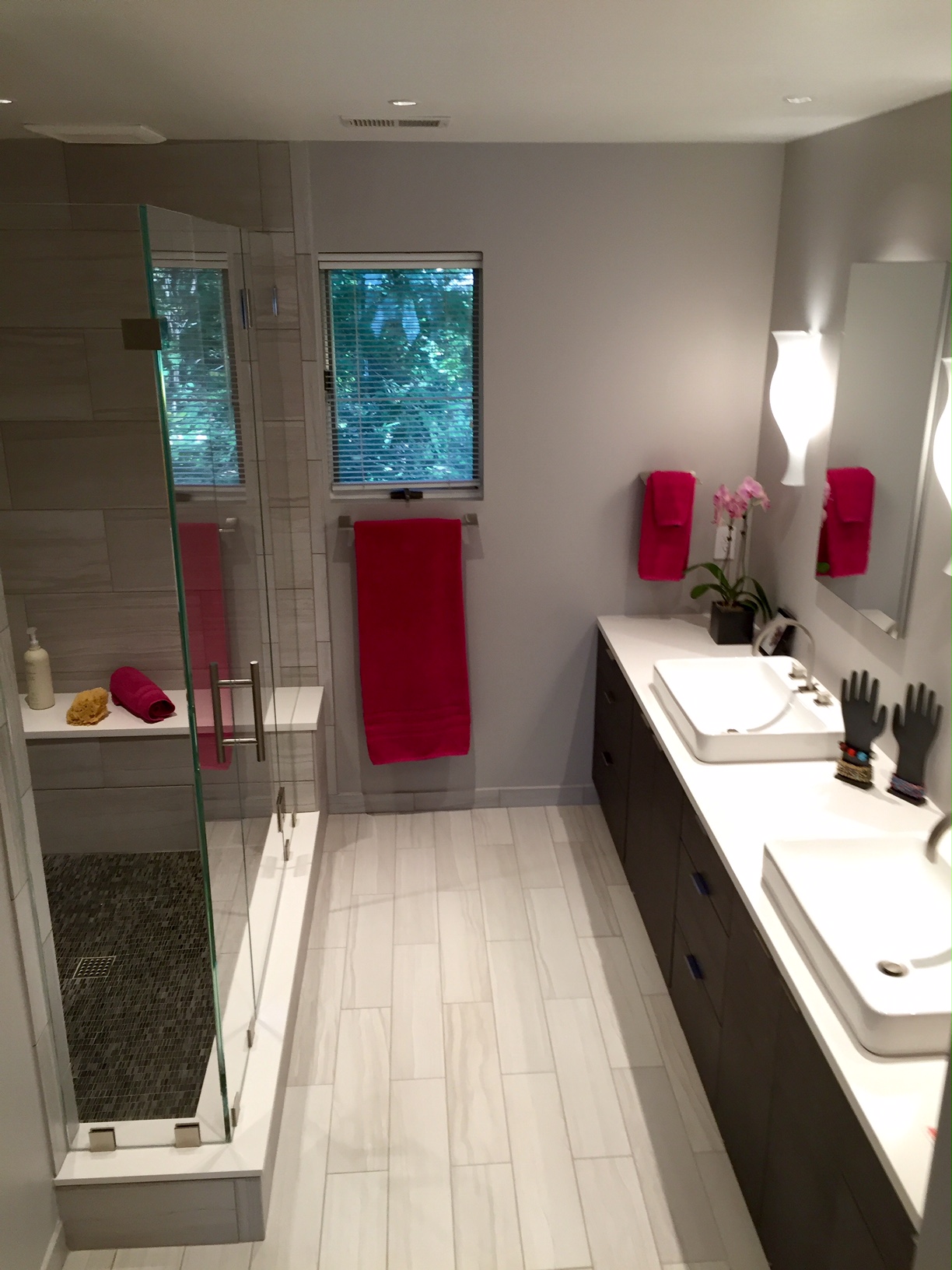
For this master bath renovation, I envisioned calm, quiet, peace and serenity– a clean spa-like environment. My selections were driven by elegance of form, texture and simplicity. Because this is my very own bathroom, I had the rare luxury to ponder and explore a variety of options over an extended period of time. In some ways, I struggled– My designs often emphasize color and pattern. Therefore, keeping the design very quiet with refined clean components was a satisfying challenge for me.
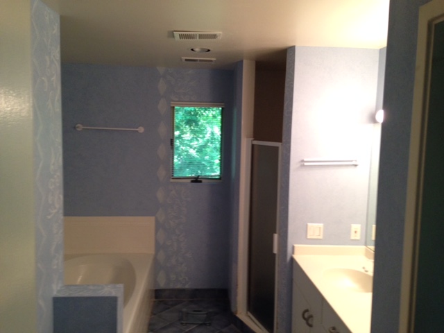
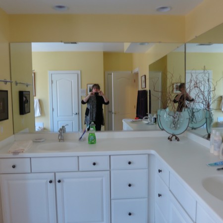
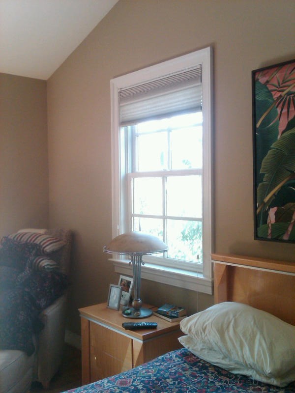
Before Construction
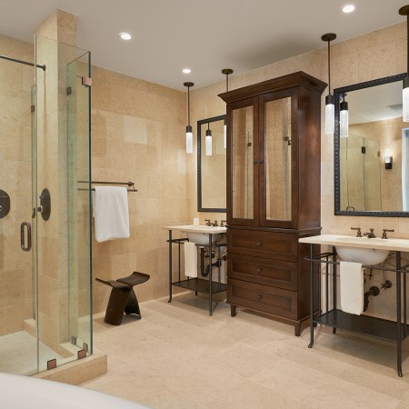
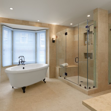
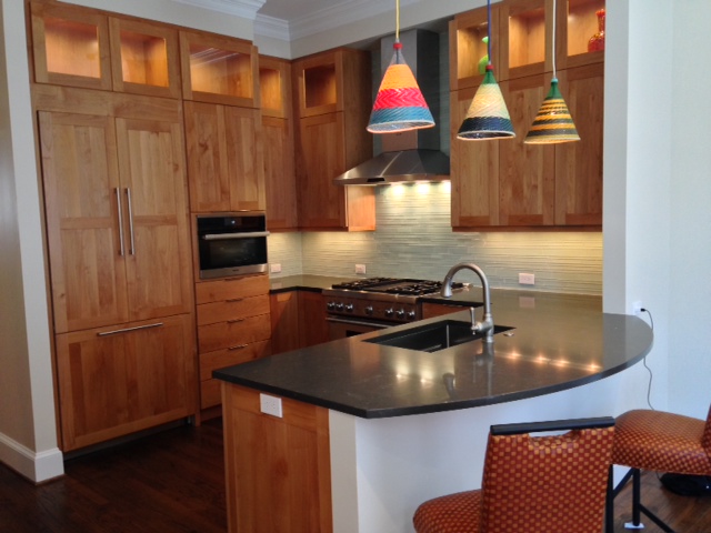
After Construction
I contemplated the revised layout of this bathroom for ages. To eliminate the bathtub or not? To keep two sinks, or just one? Ultimately, I decided that we never use the tub– so added space for a roomy shower would be a blessing. We DO use the two sinks, so I kept those in the final design.
One selection influenced the next. I first chose the simple striated gray and white porcelain tile in plank and subway tile shapes for the main bath floor and shower walls, along with the mosaic accent tile for shower floor and niches. The soft grays and subtle whites then influenced my other selections in terms of color palette and overall feel. The clean, curvilinear lines of the Graff faucets inspired me to select the elegant shape of the Italian blown glass sconces. I envisioned clean-lined rectangular porcelain sinks that mounted above the counter; the final sink selection was reality-based– these sinks were lovely AND available within the necessary time frame when others I’d selected didn’t arrive as ordered! The cabinetry is a dark, rich textured veneer. The center drawers actually pull out as one deep full clothes hamper. The quartz counter top perfectly complements the soft whites and grays of the tile.
Once final art and decorative elements are added, I promise to provide some updated photos of this bathroom. It’s a joy to use the new space, and I will continue to contemplate the final decorative elements for a bit longer.
There are many people whose expertise and support played into this renovation. As a Bethesda interior designer and contented client, I’d like to thank Damien Jones of Executive Design Build for his diligent work in making this bathroom a reality… Will Moser of Thos. Somerville, whose knowledge is always invaluable in selecting bathroom fittings… Stacey Alas-Roque for tile and cabinetry… Linda Gombos of Annapolis Lighting for her well-informed support as well.
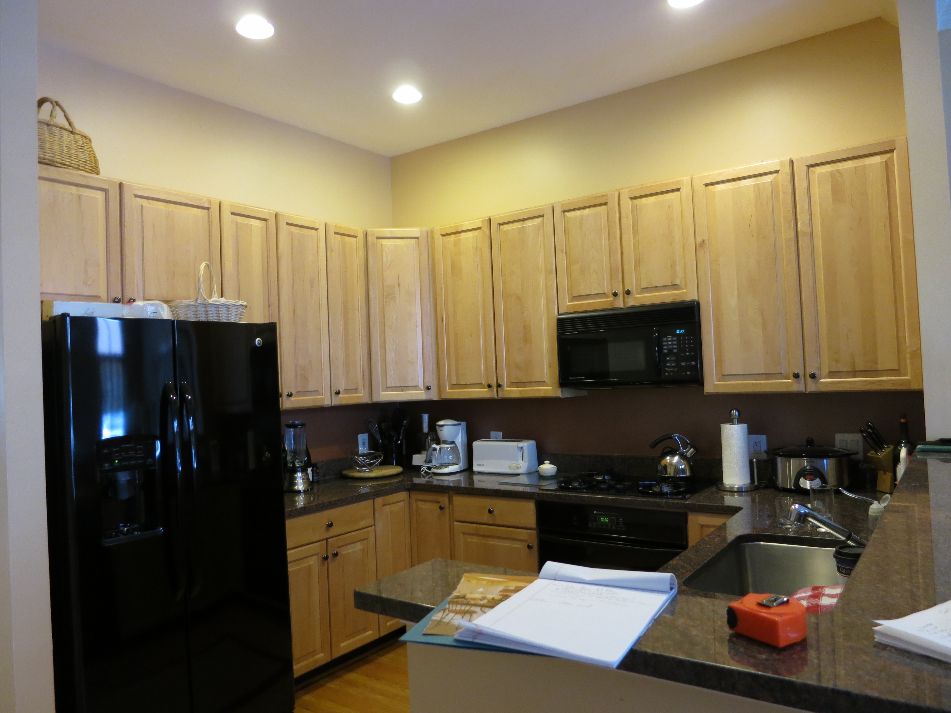
 Everything about this dated townhouse kitchen in Bethesda, Maryland needed to be updated— from top to bottom! Space needed to be optimized, appliances and surfaces updated. The homeowners envisioned a colorful and craft-filled kitchen, with quality appliances and workspace that could welcome two active cooks in a small area. These factors inspired the design of this intimate yet guest-friendly space.